
As our collective societal attention spans shrink, it's becoming increasingly important to get your ideas across in a quick, interesting, and accessible way. That is where the concepts of data visualization come in. You can collect the most amazing survey data in the world but it doesn't do much good if you can't convey the meaning of it to anyone. This will be true for virtually any career our students find themselves in, from government to business to the non-profit sector. Visual images spread virally and powerfully and are important policy and advocacy tools. The days of putting up an excel table and expecting your audience to dissect it are slipping away I think. We saw lots of great examples of this during the election as the electoral math was presented to us. (ie: this awesome interactive Paths to the White House scenario tree at the NY Times)
One growing career in this area is in "Data Journalism." A good description in The Guardian can be found here (on 'punk' data journalism) and here (more of a history) and in the NY Times here. Some of the leaders in this are the NY Times, the NPR Daily Viz and the Guardian Data Store who every day churn out fantastic infographics which help to parse a sea of data into something readily accessible. USA Today I think is the news source that is typically associated with this idea, and sometimes thought of in a negative way as "dumbing down" information into infographics, but the types of things the NY Times is doing are quite the opposite of dumbing down, and are often very sophisticated data analysis. Just because it's easy to understand doesn't make it dumb - it means it was very thoughtfully presented.
Simple word cloud tools like Wordle and Tagxedo can also help to make sense of qualitative data and see patterns emerging from words and themes.

This idea of data visualization is an area I'm becoming increasingly interested in personally, likely due to my economist need to have a graph or chart to explain everything. Ultimately, this is an area I would like us to push to develop as a program minor or applied area, hopefully in conjunction with the design department. If anyone from Art & Design is reading this, or students have a contact for me over there - please put a bug in their ear to contact me or Nels ... we've been trying to coordinate someone but haven't had much success so far. We think it would be a fantastic tool for our students to develop but we don't currently have the expertise to teach the concepts or methods. In the meantime, here are some examples and some tools to get you started...
Some interesting references and resources:
Software Tools:
Tableau free visualization software (there's also a more advanced pay version)
Many Eyes simple IBM tools for things like bubble charts, maps, etc
Piktochart free and subscription options
Wordle & Tagxedo - free word cloud tools
Revolutions How to use free R software for data analysis and visualization
NY Times Viz Lab
Guardian DIY Tools
Google Fusion Tables
DailyTekk infographic tools
Some great blogs to follow:
Visual.ly Blog
Information is Beautiful
Junk Charts - (this one is cool in that it shows bad examples and how to improve them)
Chart Porn (not actually porn! Not to worry)
Guardian Data Blog
The Daily Viz
PopChartLab
Flowing Data Blog
Eager Eyes
Visualizing Data
50 most stunning examples of Data Visualization
http://blog.visual.ly/10-things-you-can-learn-from-the-new-york-times-data-visualizations/
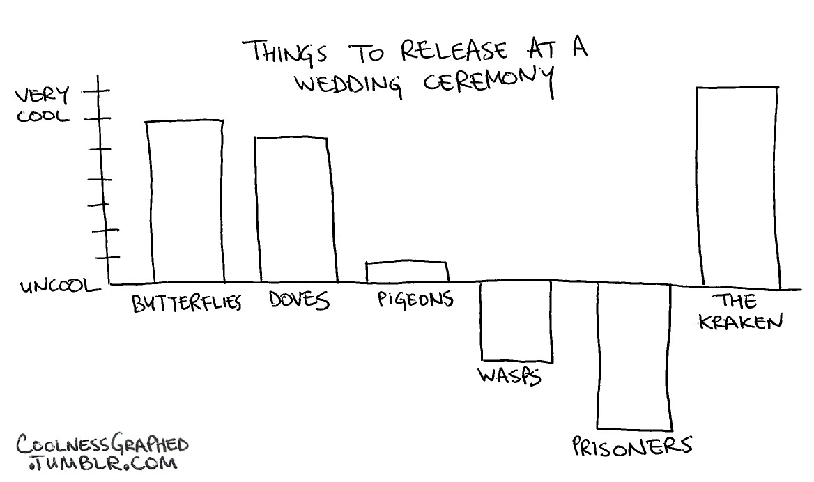
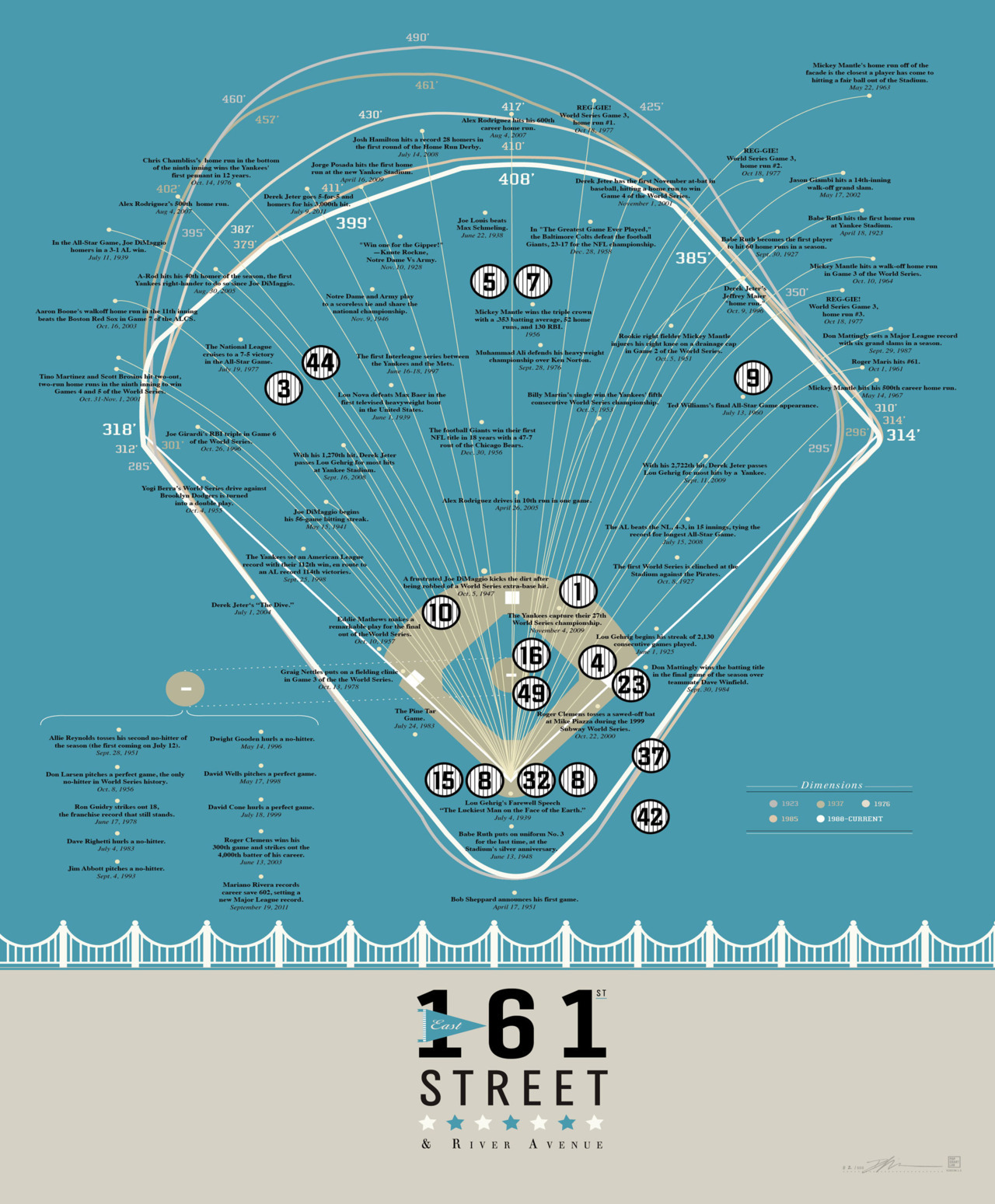
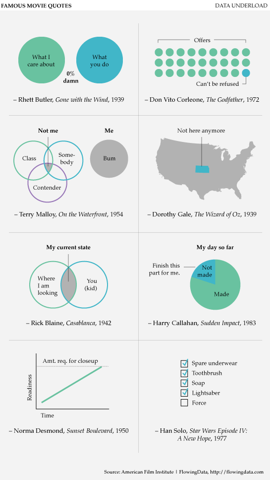
And some fun examples:
Here's a fun way to present survey data:


Description of the Military
Here's a couple of Game Theory ones for my ECON 360 students:

And finally, if you REALLY want to get fancy, you can have interactive ones like this:


For more on how this stuff is being used to affect policy, check out the father of the bubble chart, Hans Rosling's Gapminder website:
ReplyDeletehttp://www.gapminder.org/
This is so cool! I've wanted to learn how to do this stuff for a while since most graphs and data presented are boring and dry.
ReplyDeleteI use creately for these kinds visualizations and it is amazing to create and shares diagrams with the software
ReplyDelete